Analysis 1:
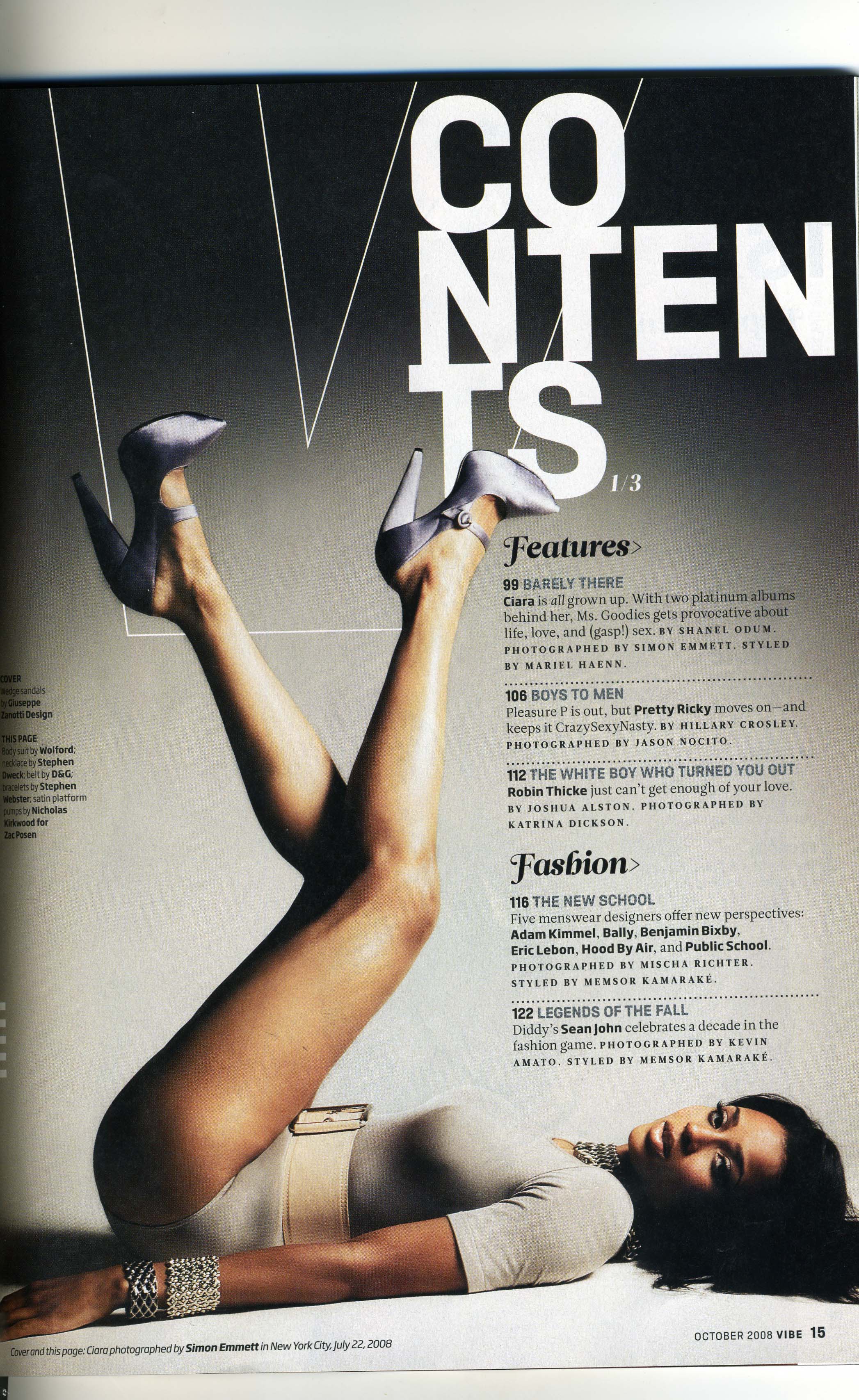
What interests me about this front cover is that they have chosen to place a huge image right in the center of the page. This draws the attention of the audience right onto the image, which is of a woman lying down with her legs in the air. This is a very unusual pose, which is what makes it look so eye catching and makes you draw your attention to this particular contents page. What also interests me is the way Contents is written at the top of the page. I really like the way the letters look like they are piling on top of each other. I think it is really effective for creating that edgy atmosphere the magazine is trying to reach.
I would say that the target audience for this magazine is young adults, as the main image especially, is quite adult and is not something you would usually see in a teen magazine like some of the ones I have previously analyzed. Young adults are typically more into edgy and modern magazines like this, which is why I think this page speaks to the audience perfectly, as this contents page demonstrates all of these factors. I also think it is appropriate for the target audience because the types of colors used are very sharp on the eye and mysterious. This kind of atmosphere excited the reader and makes (especially the younger adults and teenagers) feel like they are very grown up.
What I think I will take from this contents page is to have a very striking image that has an impact on the reader as it is a good way to capture their attention. I will also think more about playing around and experimenting with the layout of the images and text because I could achieve very imaginative and eye-catching designs.
Analysis 2:

What interests me is the way that it is so plain and simple, yet effective on the reader. The magazine is teen vogue and this issue is obviously featuring Taylor Swift, who is a young teenage country/pop singer. I like how there is a large image of her filling up most of the page What because it draws the target audience and the reader in and gets them interested in the magazine. What also interests me is how neat and tidy the page looks. Usually teenage girls are drawn in by using bright colors, fun fonts and lots of images. By using subtle pink and red colors, the title still manages to come across appealing to the reader because it does have some very girly aspects, including the image of Taylor Swift.
The use of pink hearts across the page is what really gives in the feminine appeal and reaches out to the target audience, making them attract to it. I think Taylor Swift is the main selling point of this page as she is a singer that many young teenage girls look up to and aspire to be like. The caption 'Get to know the real Taylor Swift' also captures the target audiences attention and gets them to be interested because it suggests that the reader can get to know more about her life out of the spotlight and about what she is currently up to.
I think what I will take from this contents page is that you don't need bright and bold colors to capture the audiences attention and get them attracted to the magazine. Also that you don't need a very busy page either, because simple layouts can also be effective on drawing the reader in.
Analysis 3:
Analysis 3:

What really interests me about this contents page is the main image, because it is very cartoon like. It shows an image of singer Katy Perry holding a giant mushroom in her hand above her head. I really like this because it is very cute and fun and is the kind of style I really like on a contents page. I also really like it because it has a comical feel to it. What also interests me is how the list of contents are all squashed up in the right hand side in a coulomb. The writing is also very small, which I think is the only flaw of this contents page as it leaves a lot of empty space around the image. However, I do like how it creates an isolated look as it makes the image look more comical and 'odd'.
I think the main target audience would be ages 16 - 24 as it has quite a young and modern style about it. I think it also attracts the target audience because it features Katy Perry, who is very popular role model for this type of age group. The target audience are also the type of age who would most likely listen to Katy Perry's music and be big fans of her. The layout is very simple, which makes the image of Katy Perry the center of attention, which helps draw the audience in and the fact that the image is right in the center helps her be more noticeable.
I think I will consider having my image right in the center as it is a good way of capturing the audiences attention. I will also try and not worry about having my contents page crammed with images and information, because the page can still look effective with only one image and a simple layout.
No comments:
Post a Comment